Query Profiler
The procedure for installing modules and extensions is described in section “Installation of additional elements”.
The Query Profiler module is designed for profiling queries. The module’s operation is based on collecting statistics from the pg_stat_statements extension. All data from pg_stat_statements is grouped in a certain way to eliminate duplication for identical queries.
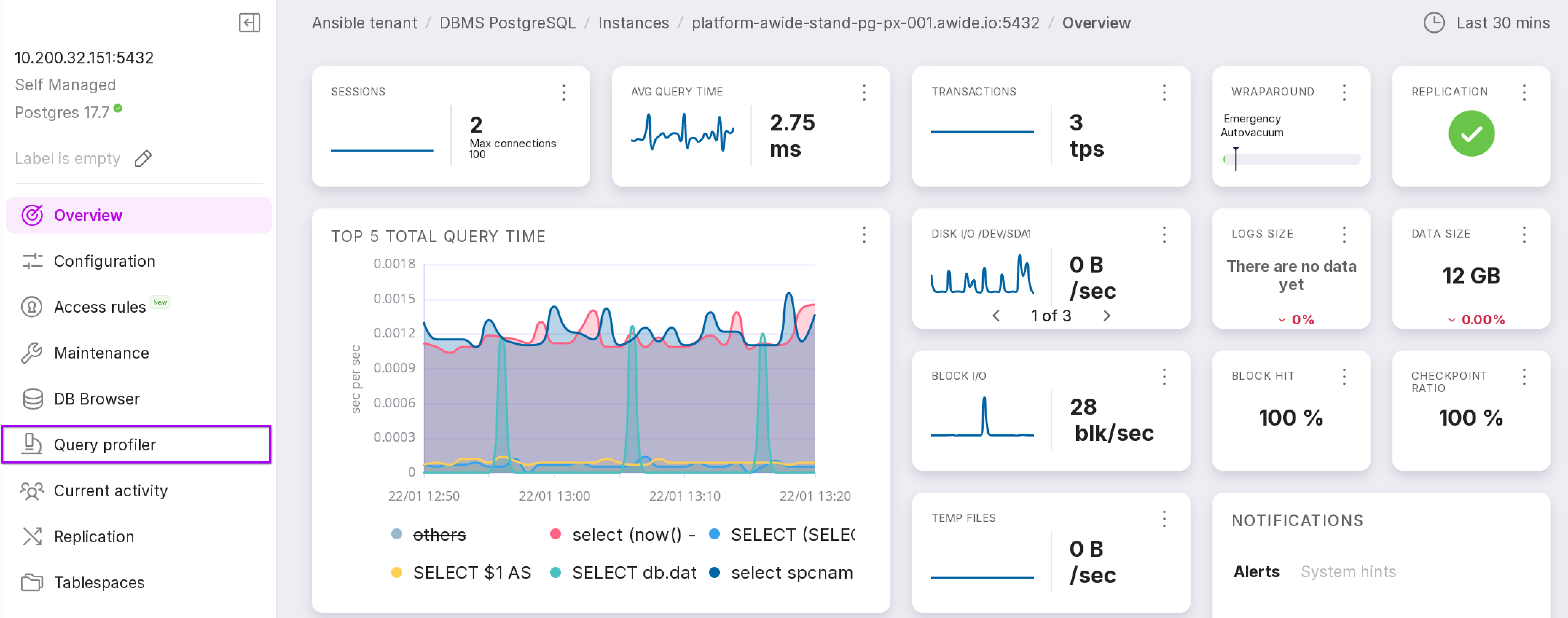
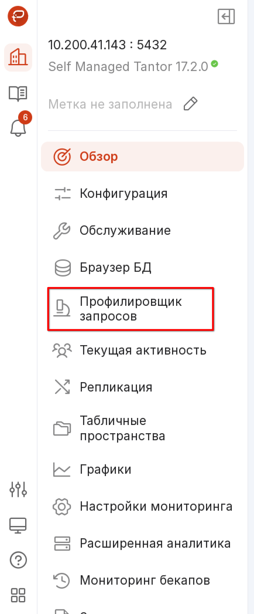
To open this page, click on “Query Profiler” in the left menu panel of the instance.
On each iteration of collecting statistical information, only the 50 longest queries are sampled, while all others are grouped as ‘other.’
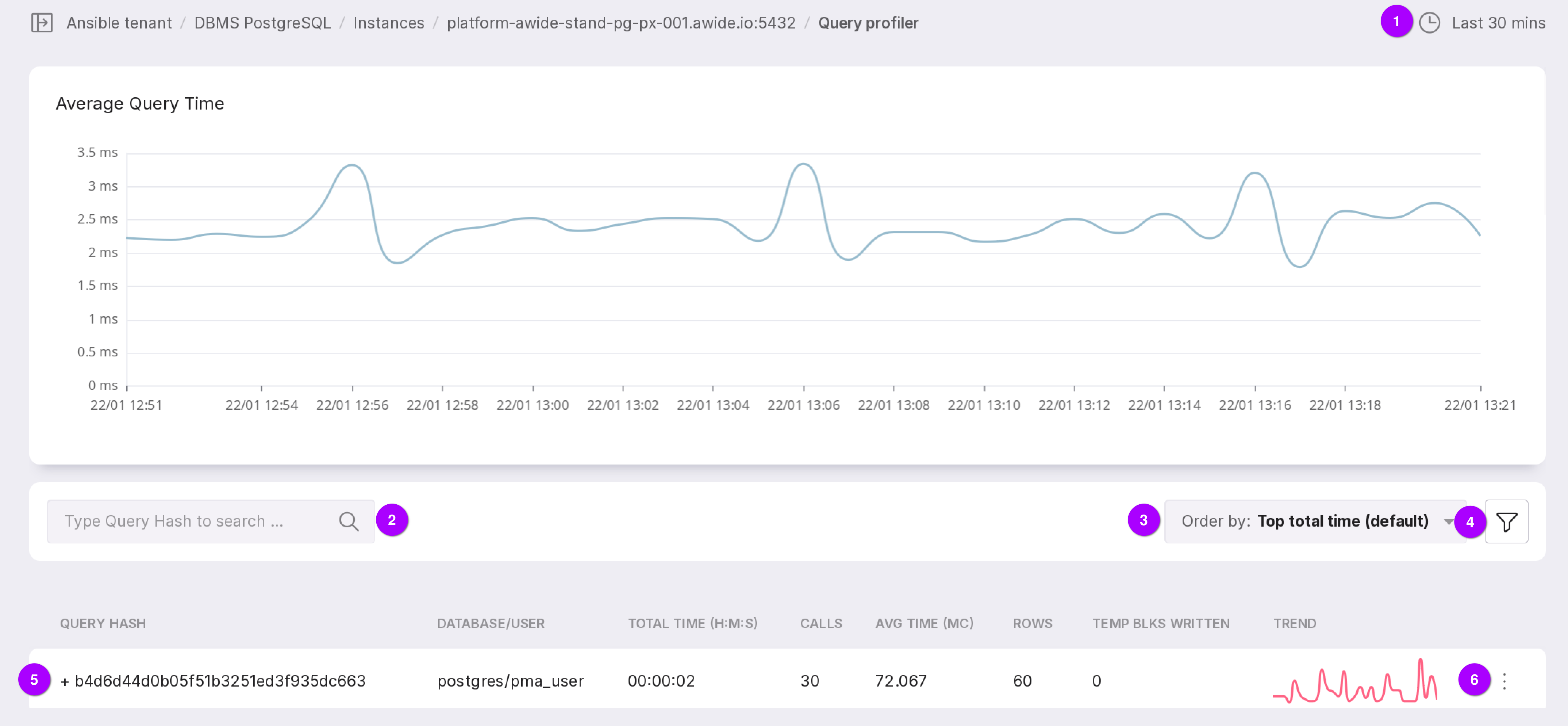
Let’s review the functionality of the module, as numbered in the figure above:
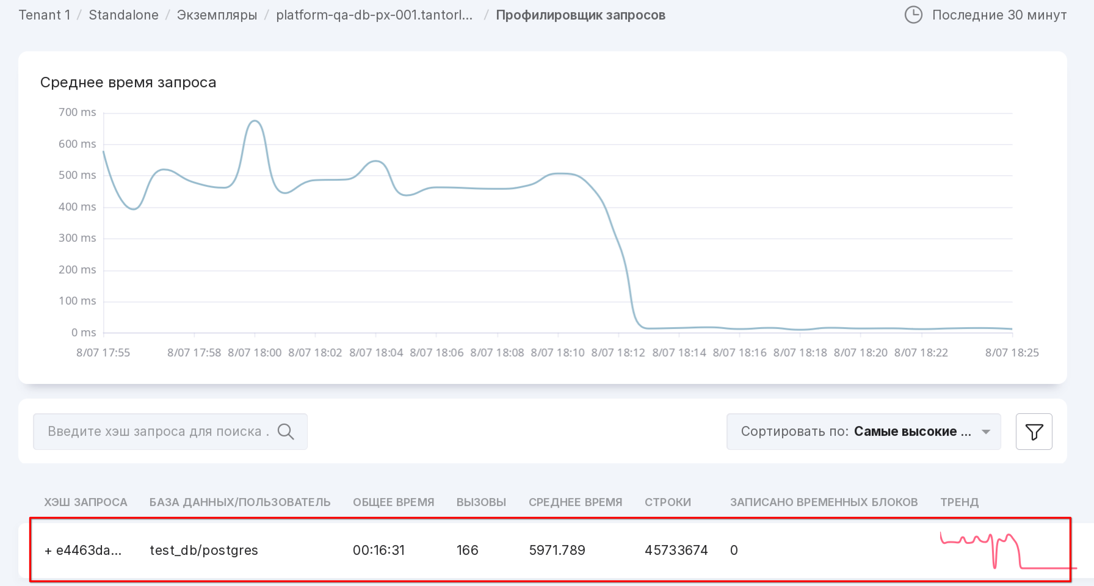
The chart shows the average execution time of queries. The dropdown list in the upper right corner allows you to select the time interval for which you need to display information. The selected time interval also affects the list of queries below. Seven intervals are available:
last 30 minutes (by default),
last hour,
last 3 hours,
last 8 hours,
last 12 hours,
last day,
last 7 days.
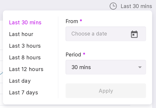
You can also select a date from which the interval will be calculated.
Search by query hash.
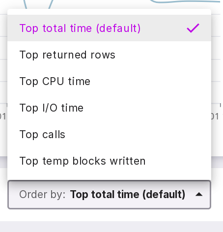
Query order by:
Top total time (default);
Top returned rows;
Top CPU time;
Top I/O time;
Top calls;
Top temp blocks written — number of blocks written to temporary storage.
Filter that allows filtering by databases.
The symbol “+” opens a substring to see the request itself.
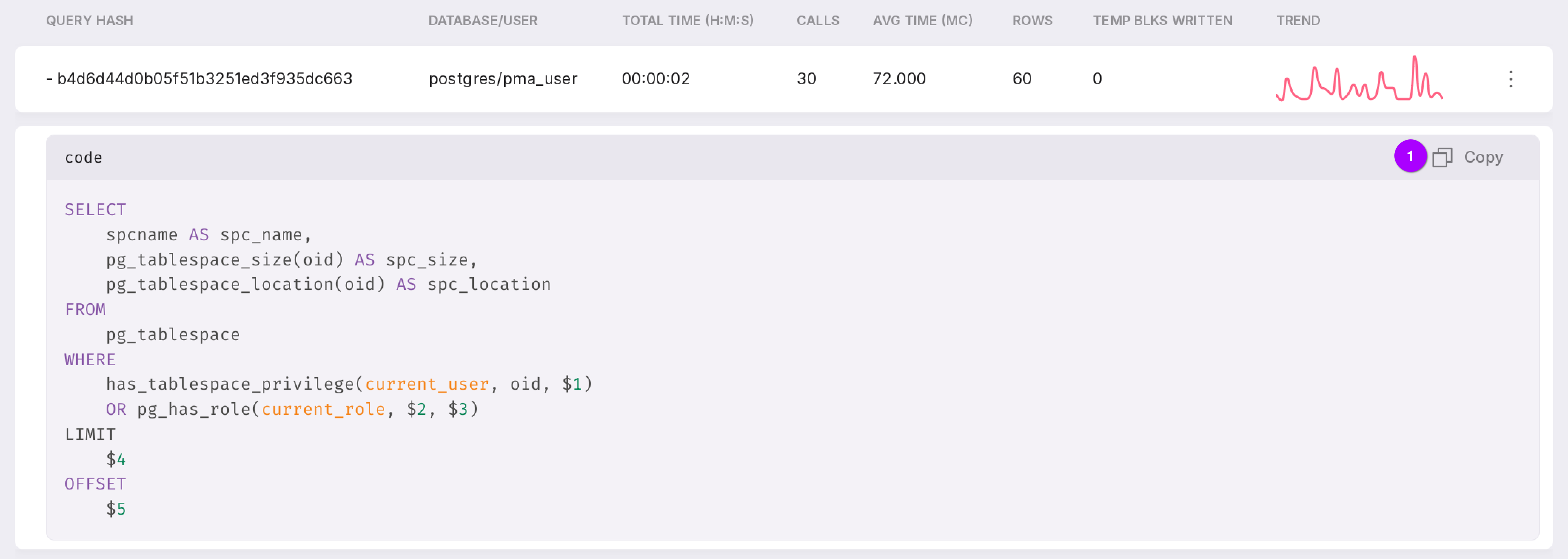
The query can be copied to the clipboard using the button marked with “1” in the figure above.
Menu with the “Details” option for a detailed review of the query.
To view detailed information, click on the query line or select “Details” from the context menu.
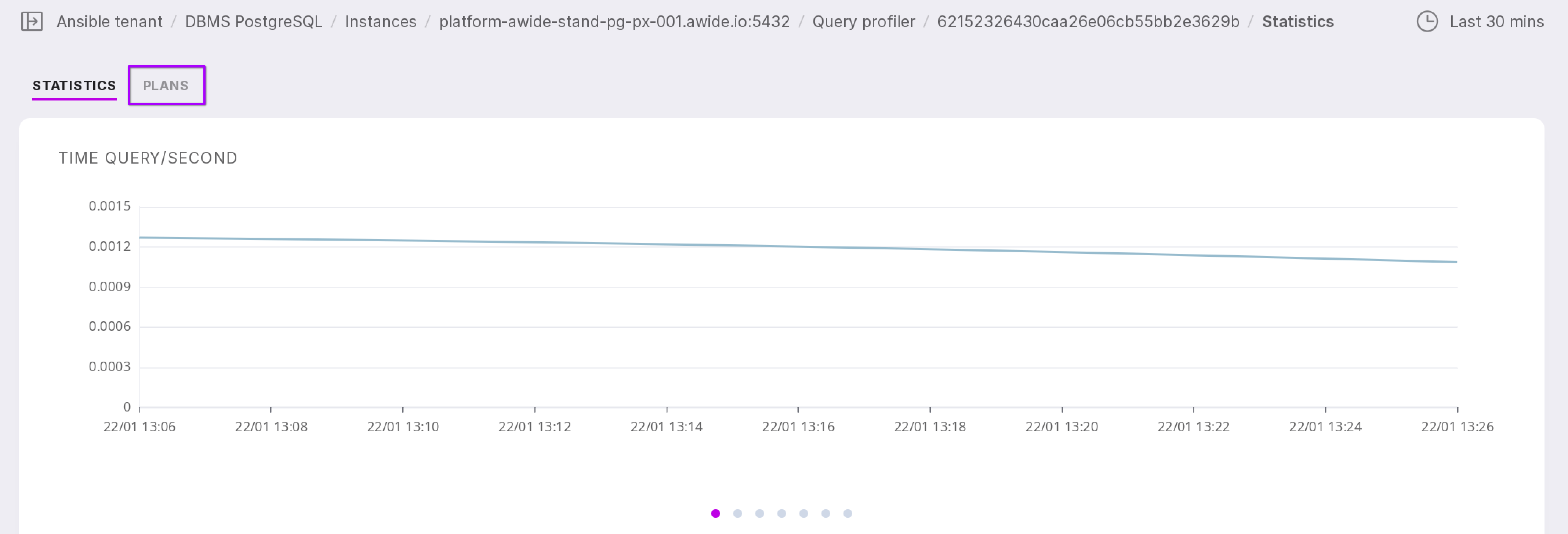
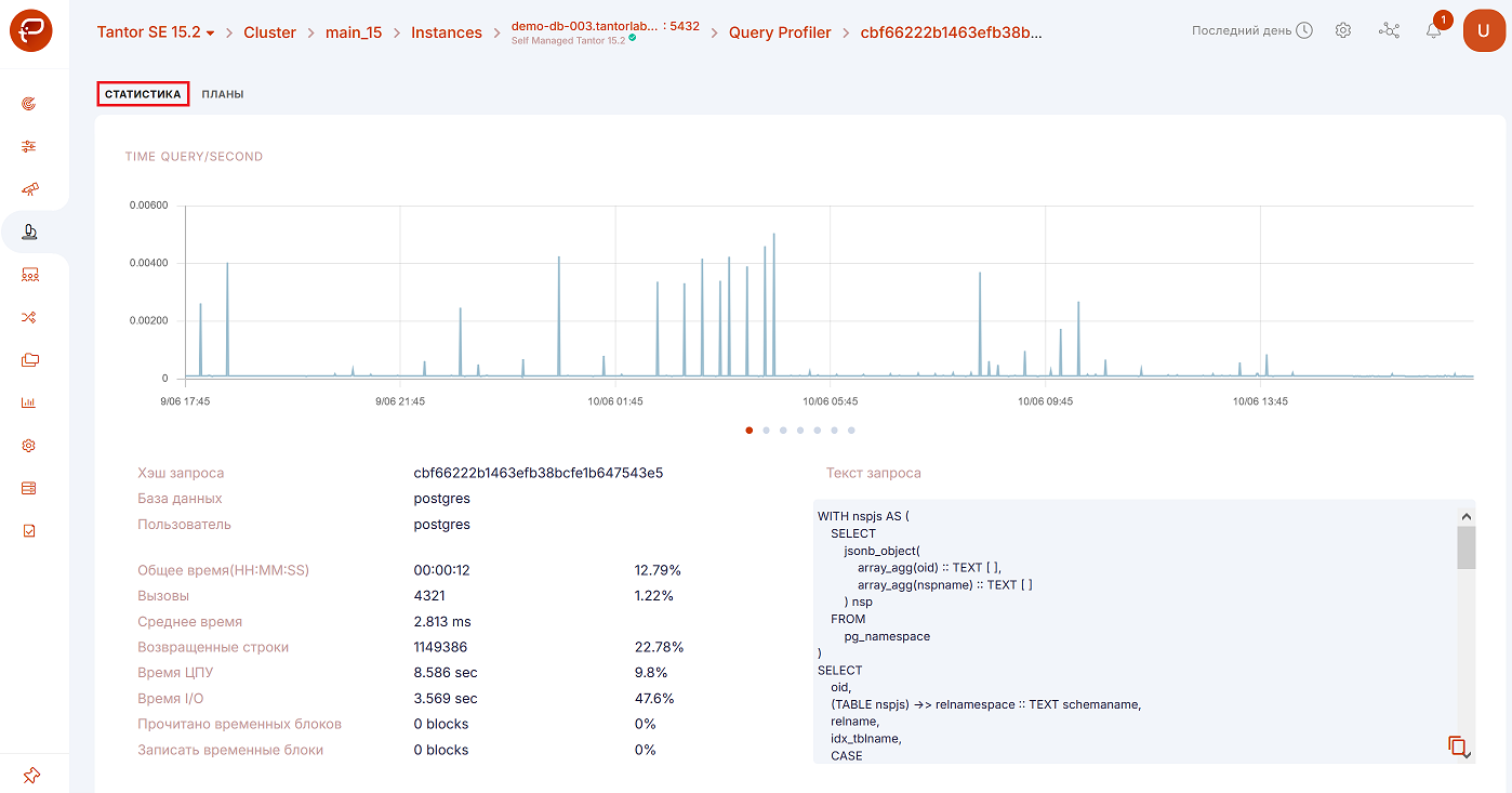
“Statistics” tab
After navigating to the detailed information for the query, the “Statistics” tab will open.
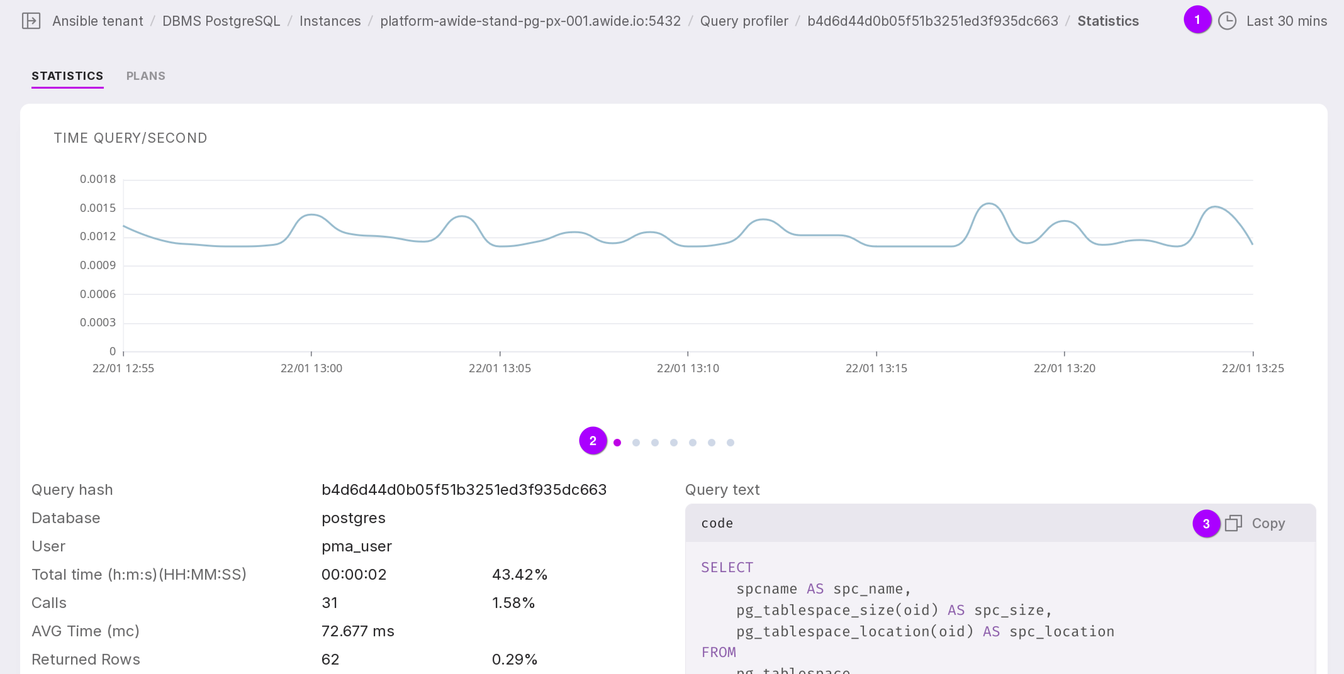
Let’s take a closer look at the tab as numbered in the figure above:
The chart displays data for a specific time interval. You can choose one of seven time interval options:
last 30 minutes (by default),
last hour,
last 3 hours,
last 8 hours,
last 12 hours,
last day,
last 7 days.
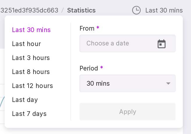
You can also select a date from which the required interval will be counted.
You can view six charts. To switch between them, click on the dots.
Time Query/Second,
Calls/Second,
Rows/Second,
CPU Time/ Second,
IO Time/Second,
Dirtied Blocks/Second,
Temp Blocks(Write)/Second.
The query text can be copied to the clipboard.
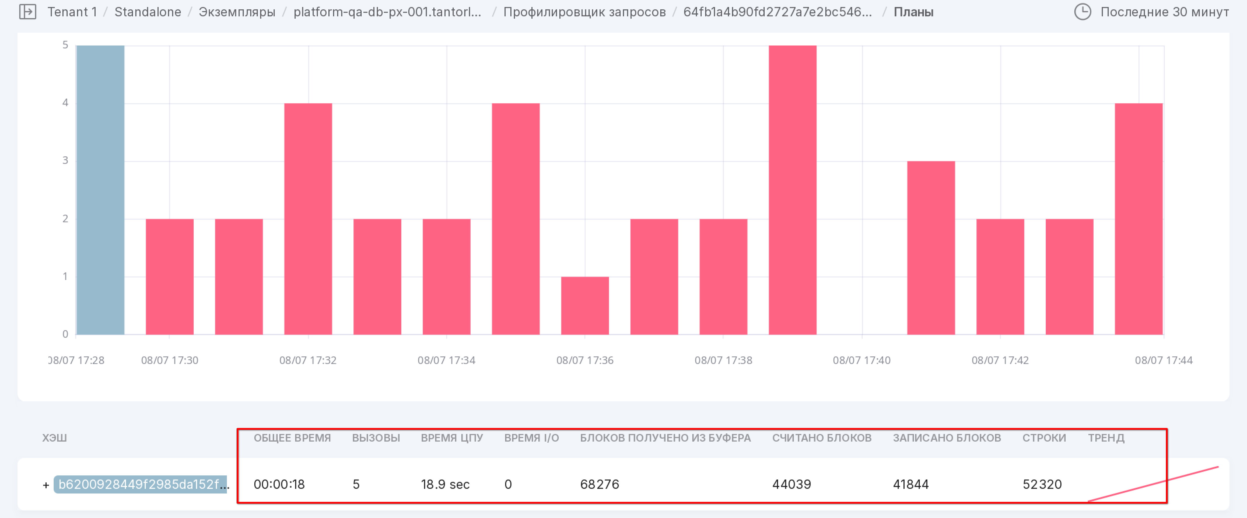
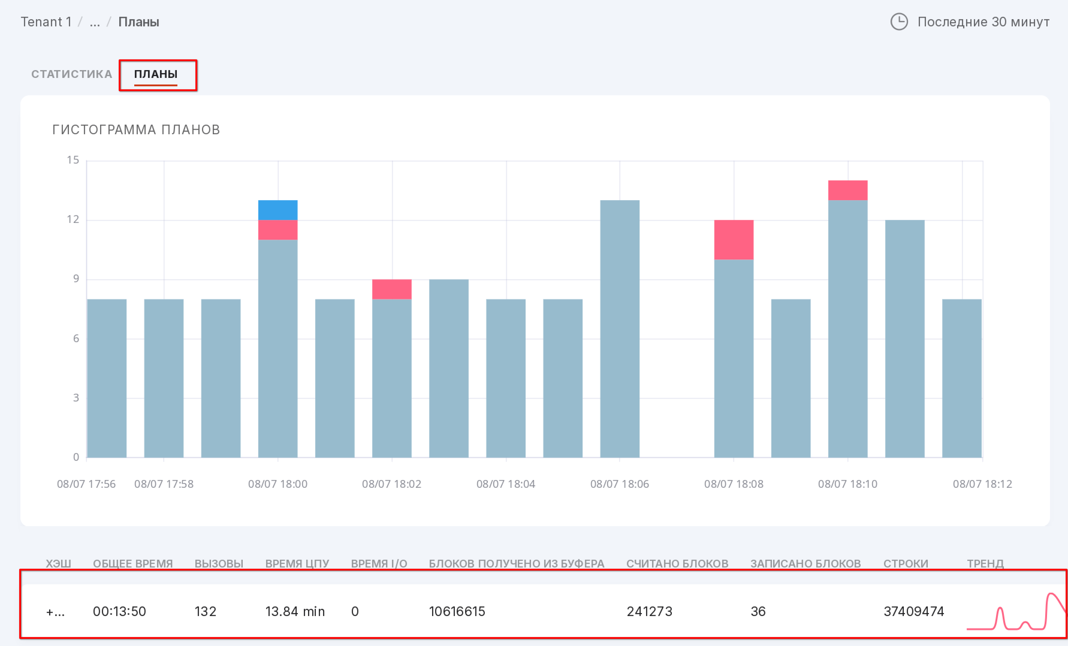
The “Plans” tab
To work with query plans, install pg_store_plans extension. The installation instructions can be found here “Installation and configuration of the pg_store_plans extension”.
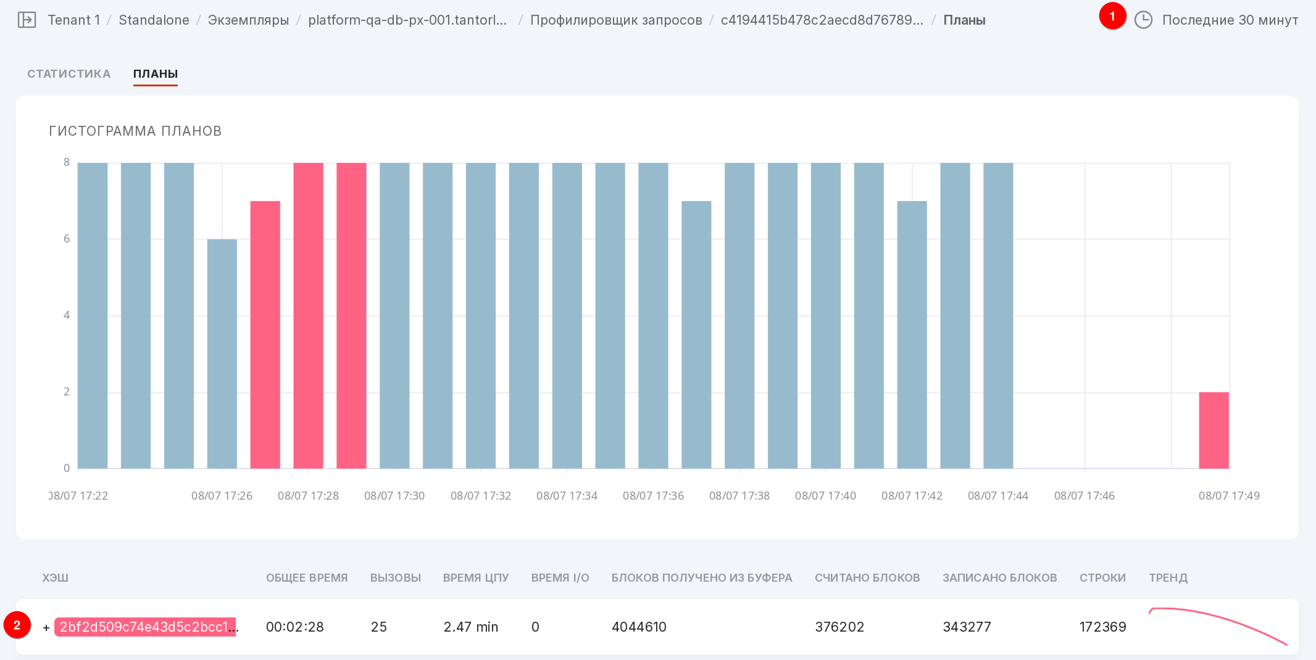
Data on the usage of query plans is presented in histogram format. Each plan is displayed in a unique color. The height of the column in the histogram for each plan depends on the number of calls to that plan.
Let’s take a closer look at the tab as numbered in the figure above:
You can choose one of seven time interval options:
last 30 minutes (by default),
last hour,
last 3 hours,
last 8 hours,
last 12 hours,
last day,
last 7 days.
You can also select a date from which the required interval will be counted.
The symbol “+” opens the execution plan used for the selected query.
The execution plan can be copied to the clipboard.
Query Plan Analyzer
The Query Plan Analyzer is integrated into Awide based on the service pg_explain. This integration allows the user to analyze queries and database logs within Awide and does not require sending queries and the data contained in them to external services. Moreover, Awide collects and stores queries according to the established configuration, significantly simplifying the search for queries by parameters such as query time, number of rows, and much more.
Configuration
For proper operation, install the following extensions:
pg_stat_statements, which is provided in the contrib directory of the PostgreSQL distribution and Awide DB of all versions;
pg_store_plans of the Awide build (different from the publicly available one).
Access methods
There are three methods to access the query plan analyzer.
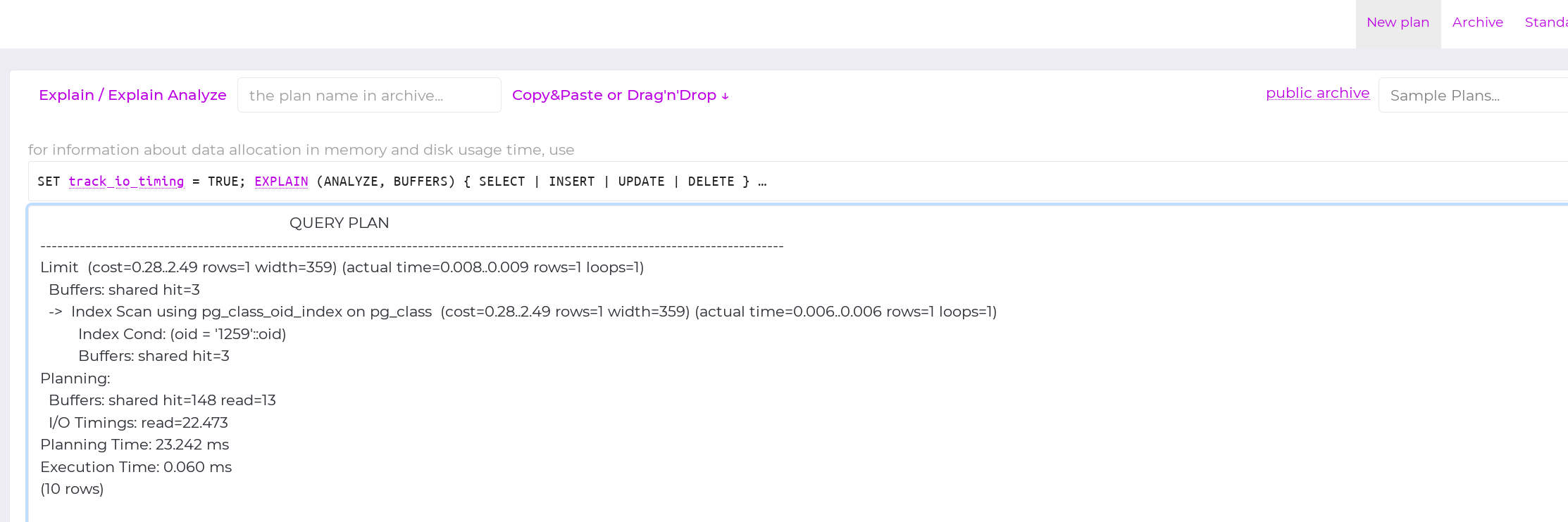
Access from the top menu:
When clicking on access from the top menu, the extension will open in a new tab and will not contain queries present in Platform. This functionality allows you to copy any query to a new window for analysis:
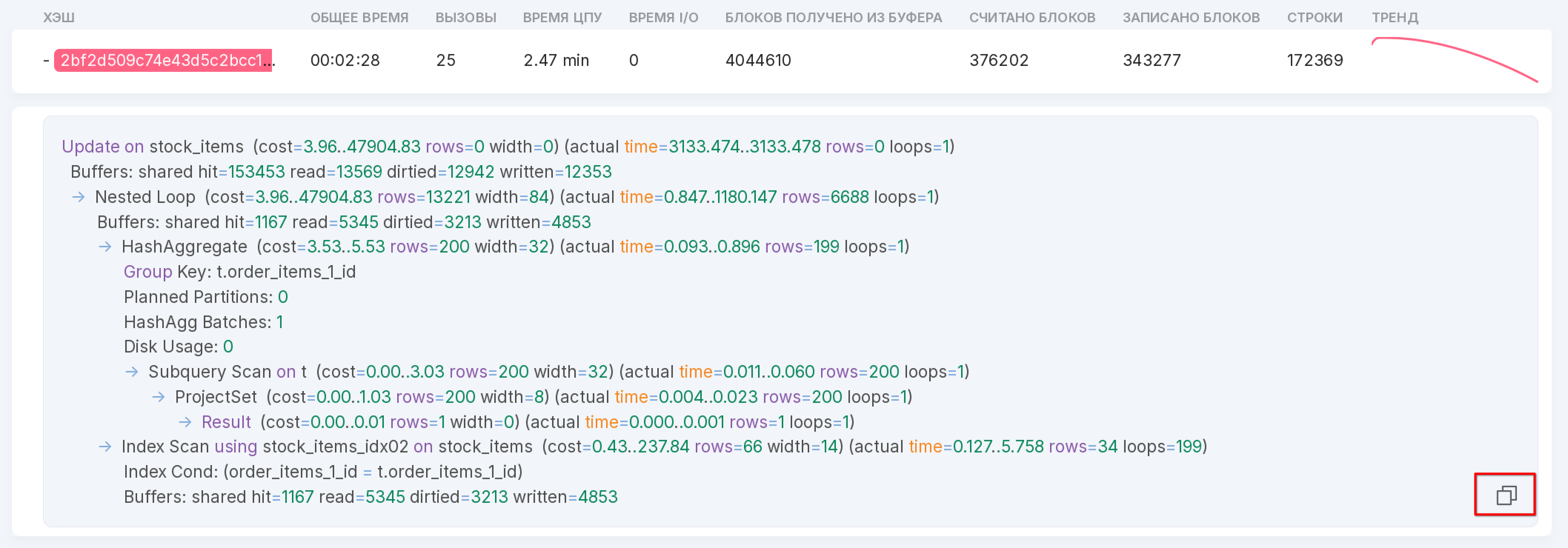
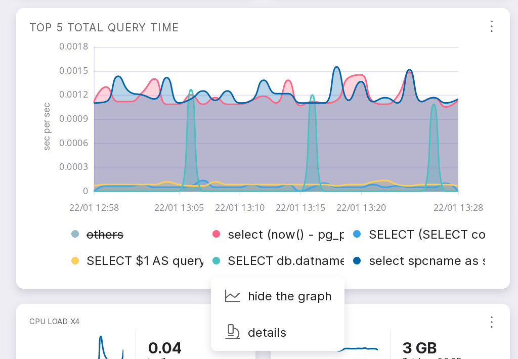
Access from the “Overview” screen of the instance through the query “Top 5 total query time”.
This method allows you to analyze a query that made it to the TOP 5.
at the bottom of the “Top 5 total query time” tile, click on the text of the query of interest;
in the opened menu, click on “Details:”
in the opened menu, go to the “Plans” tab:
As a result, a window with the analysis will open:
Access through the Queries screen.
This method allows you to analyze a query that made it to the Top 50 queries that Platform collects and analyzes. To open the query analyzer, follow these steps:
click on “Query Profiler:”
click on the required query:
a page with statistics for the query will open:
go to the “Plans” tab:
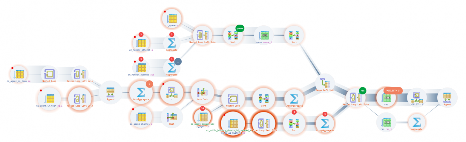
on the opened page, click on the plan of interest. A page with the plan analysis will open:
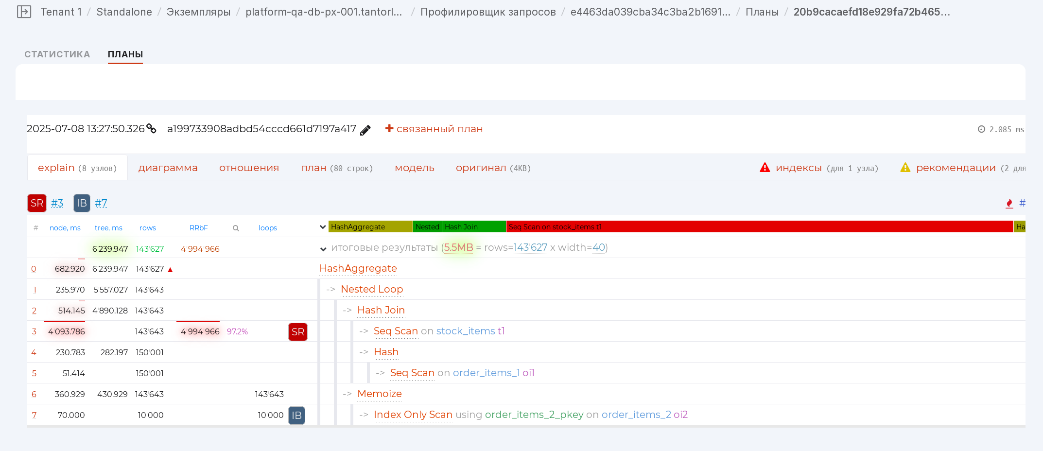
The main components
Navigator [1]
Allows you to assess with the help of a navigator bar how much time each node took. Clicking on it will take you to the required node:
If red segments dominate, you are spending a lot of time reading data (Seq Scan, Index Scan, Bitmap Heap Scan), if yellow — on processing them (Aggregate, Unique), and there shouldn’t be too many green Joins.
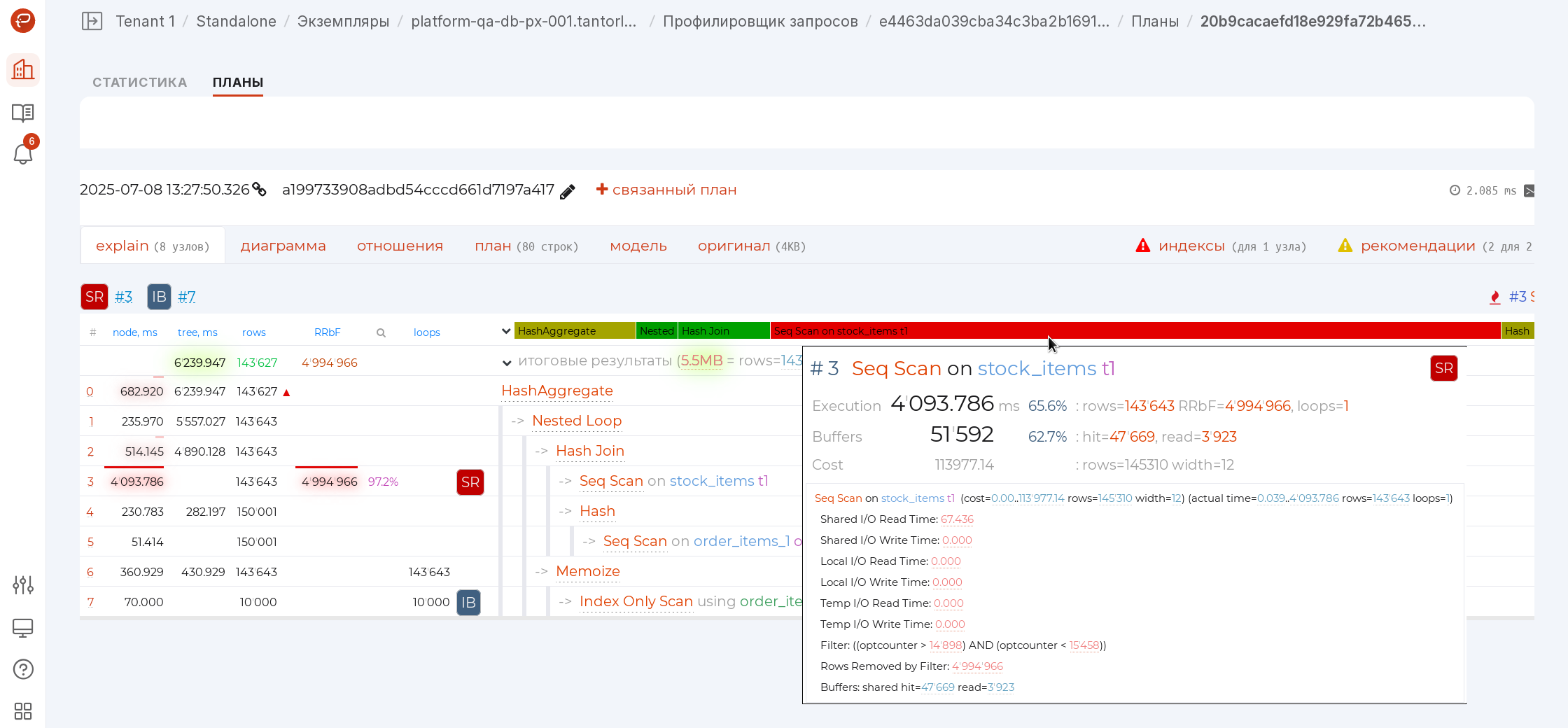
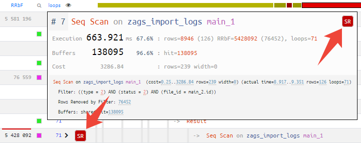
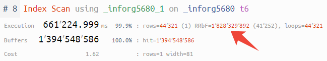
Average IO [1]
If your plan includes indicators of time spent on input-output operations (I/O Timings attribute with the track_io_timing parameter enabled), you can now instantly assess the average disk access speed for sequential and random reads or writes in the summary row:
Warning
If you see numbers in MB/s here, even though the database is on SSD, then there is clearly a problem somewhere in the disk subsystem’s operation.
rows/RRbF tree [1]
In the tilemap diagram of the plan, the rows mode allows you to instantly assess which segment of the plan generates or filters too many records.
In this mode, the nodes are highlighted where the greatest number of records were discarded due to non-compliance with the condition (Rows Removed by …). The “width” of the connection is proportional to the number of records that were passed up the tree.
The brighter the node and the thicker its “branches”, the more attention it requires:
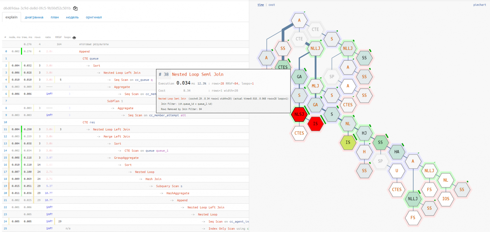
Node tooltip [1] [2]
Hovering the cursor over a node in the navigator or any other diagram, you immediately see all the recommendation icons that the service suggests:
If this is an index hint, a simple click on it is enough to go to the suggested options for suitable indexes.
Also, for all large numbers in the node text, digit group separators have been added to easily perceive the order of magnitude.
Pie chart [2]
Understanding the “hottest” points is not easy, especially if the query contains several dozen nodes, and even the shortened form of the plan takes 2-3 screens. In this case, the pie chart will help:
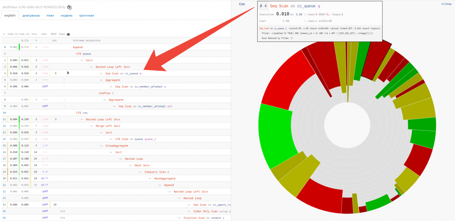
Immediately, at a glance, you can see the approximate share of resource consumption by each of the nodes. When hovering over it, an icon appears on the left in the text view for the selected node.
Execution diagram [2]
The node tooltip and pie chart do not show the full chain of service nodes attachments CTE/InitPlain/SubPlan — it can only be seen on the actual execution diagram:
Source