Archive query page
You can go to this page in a number of ways:
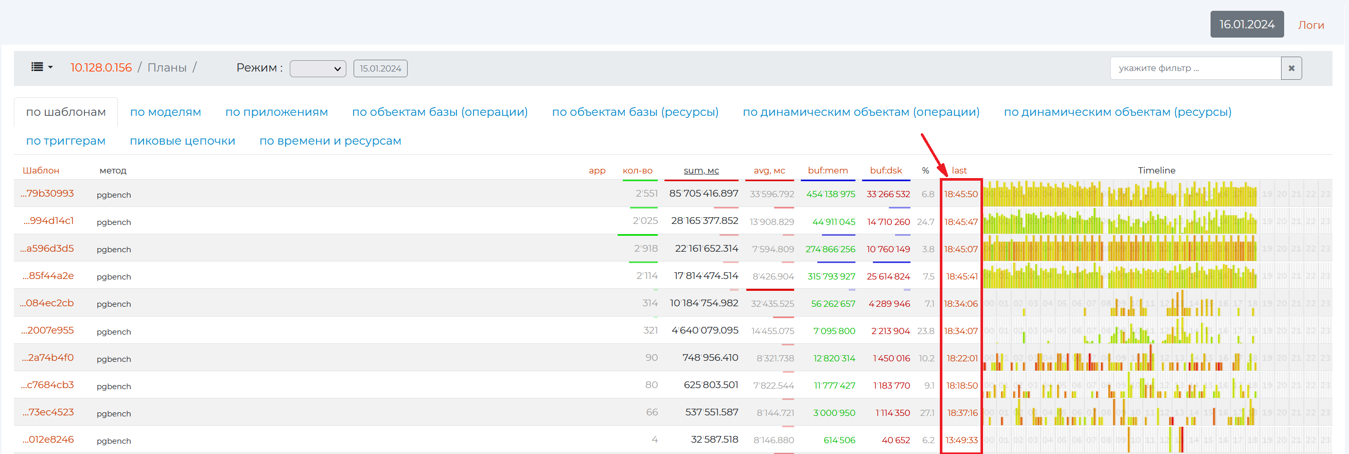
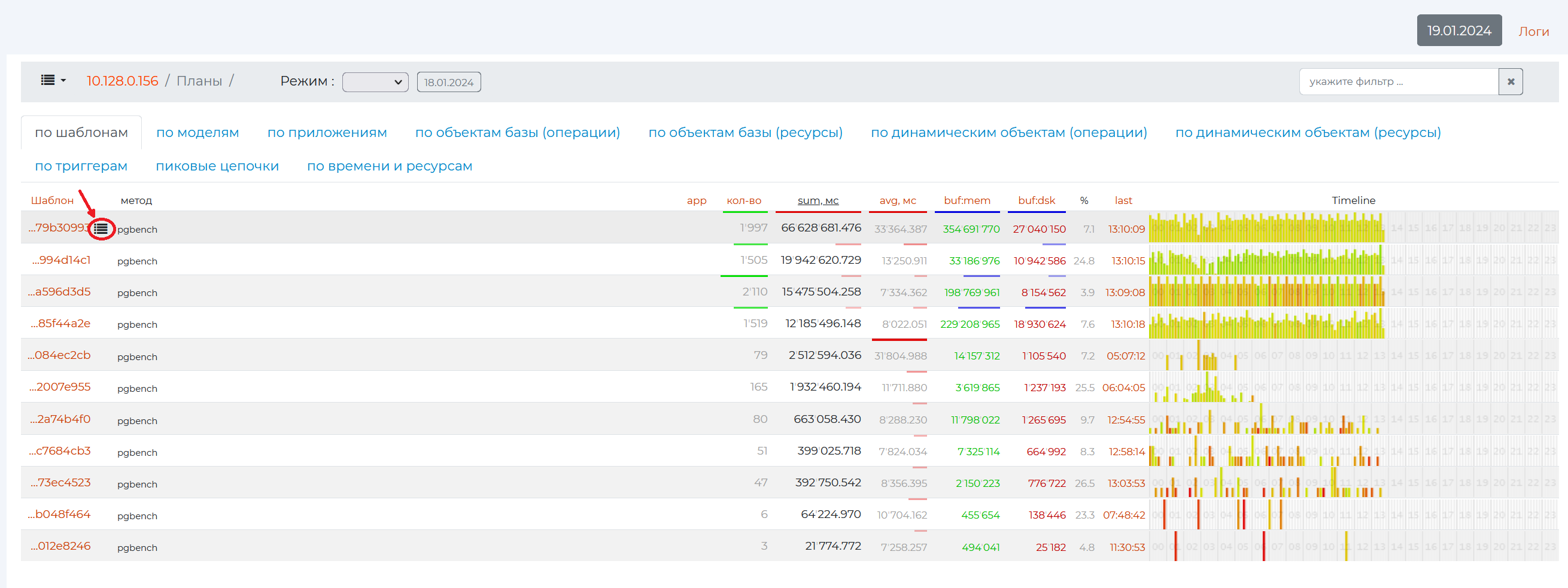
click on the burger menu → “Problematic Queries” and navigate :ref:` to the /Plans <pg_m_Plans>` page → the value in the “last” or “time” column depending on the tab you have open;
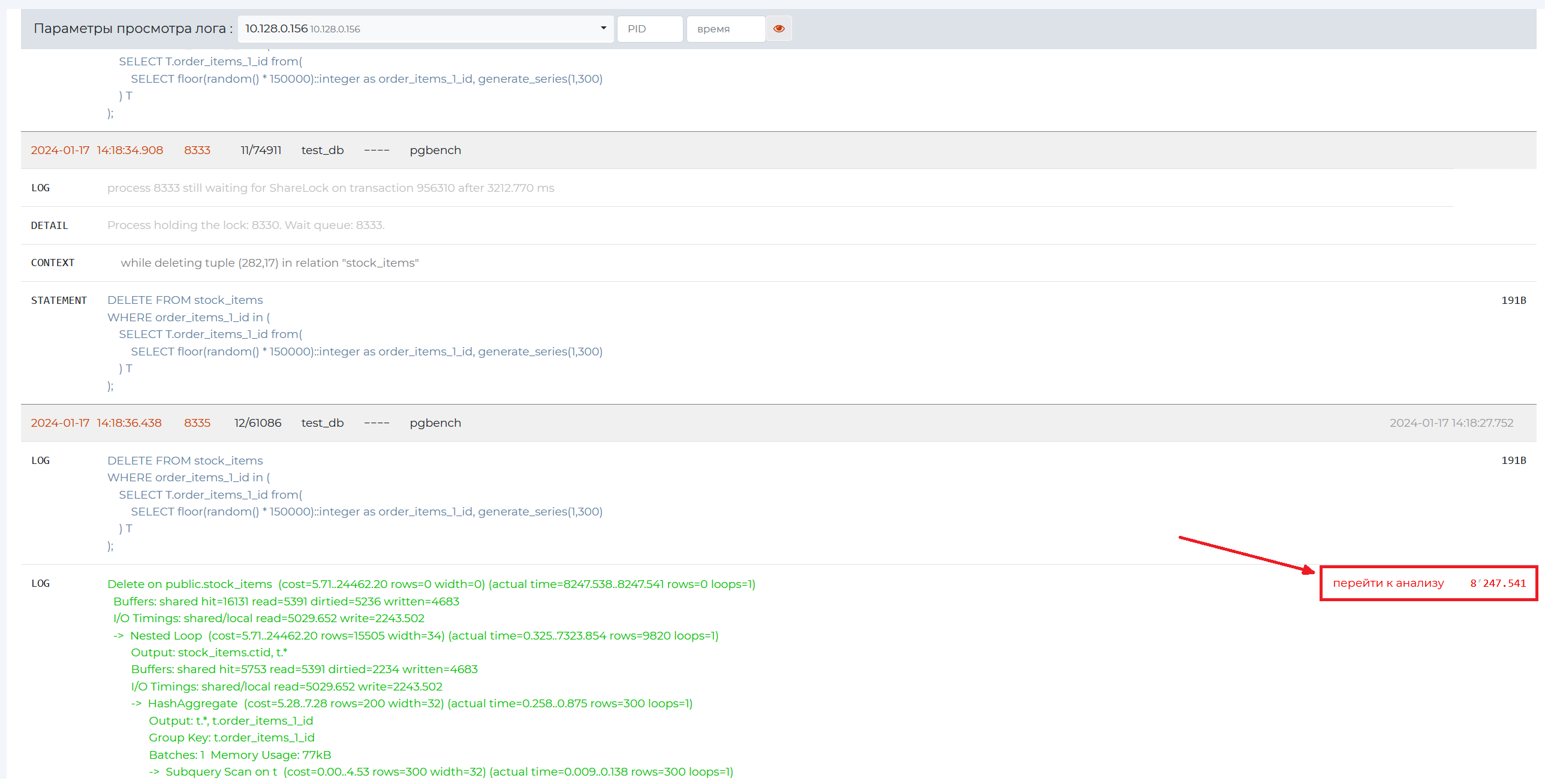
click “Logs”, select the required log viewing parameter and click ‘Go to analysis’ link.
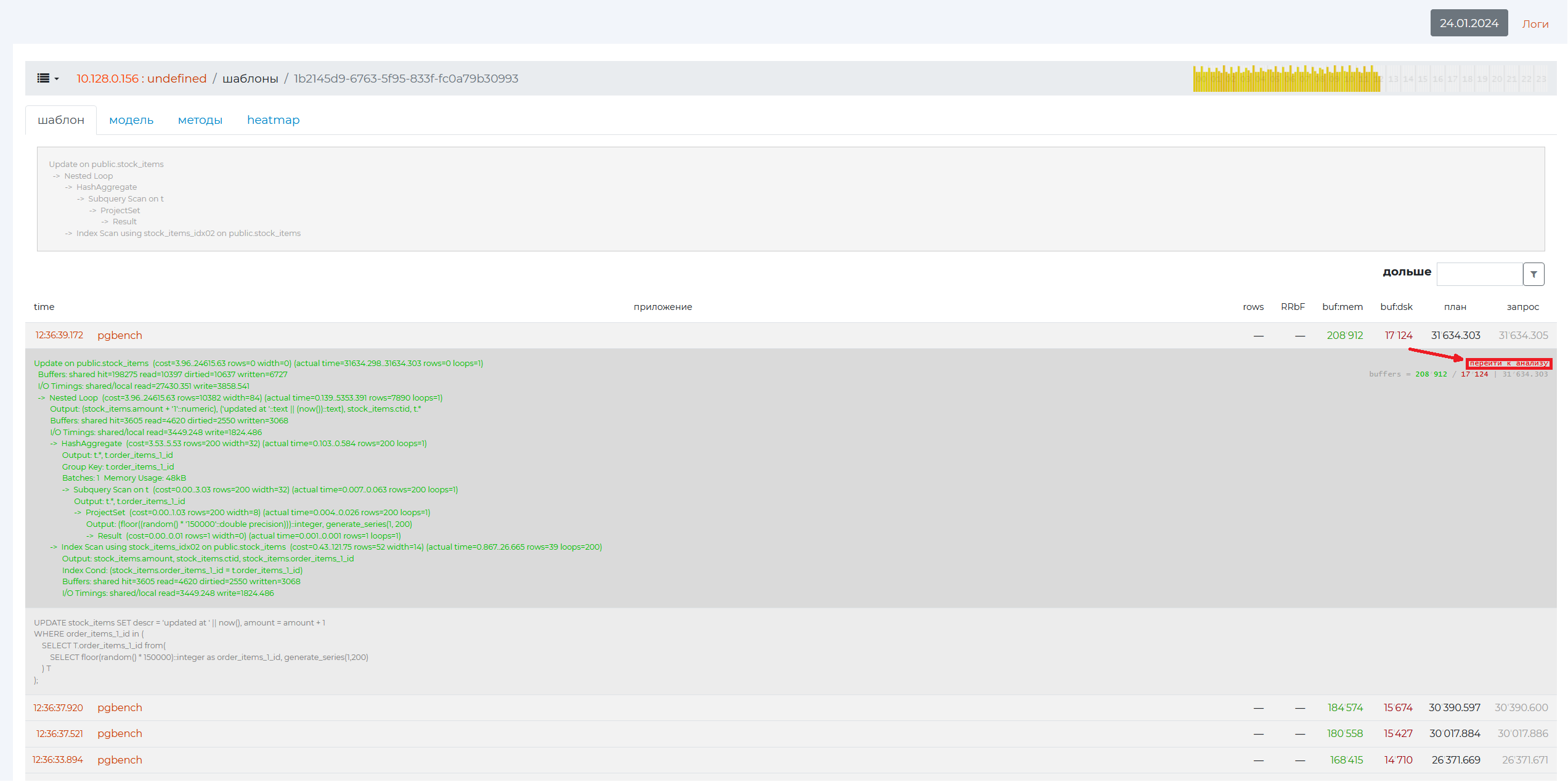
click on “Go to Analysis” in the expanded plan of the specific query of the “Patterns” page, which can be accessed from the “Problematic Queries” page.
Page Control Panel
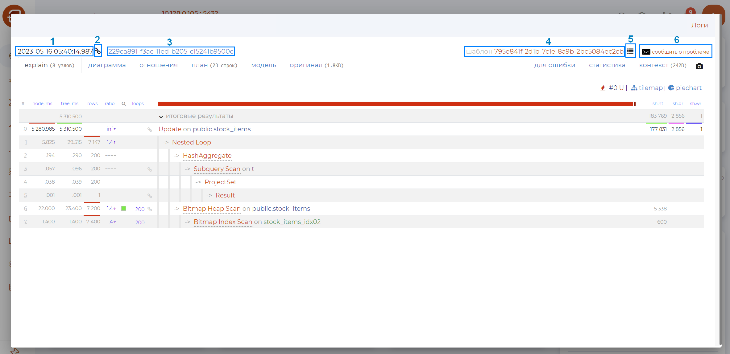
The page control panel contains the following options (as numbered in the figure above):
Date of query.
Button to copy the link to the query.
Name.
Pattern name — opens page /patterns.
Button to create a link to the task.
Button that invokes the mail client to send a message.
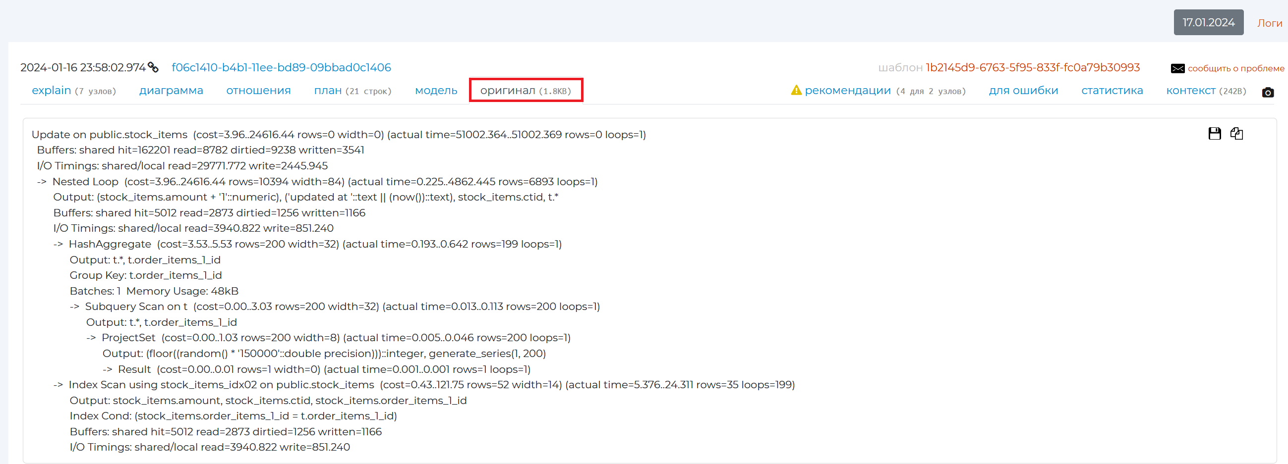
Original tab
Use this tab to view the original query plan from the archive. It can be manually retrieved using the “EXPLAIN<query_text>” command in the SQL language. Instead of <query_text>, enter the text of your query.
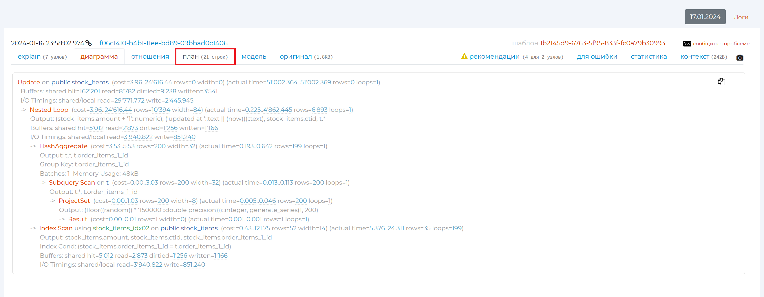
“Plan” tab
The “Plan” tab contains the same plan as the “original” tab, only in a more visual form: overloading punctuation marks can disappear, the names of each plan node are highlighted.
“Diagram” tab
This tab contains a graphical view of the query plan.
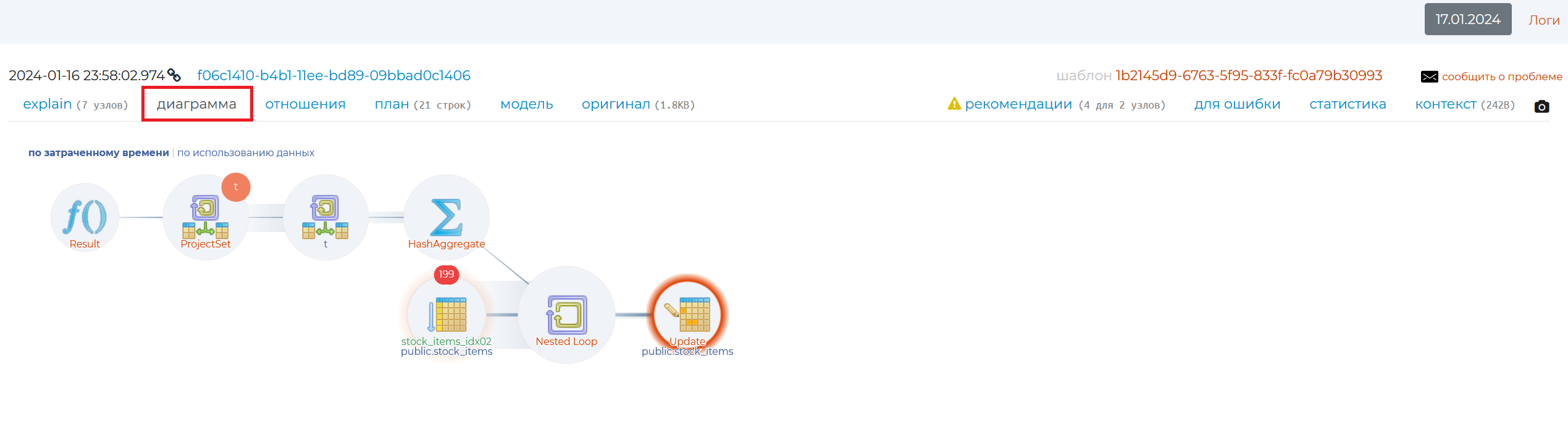
This tab contains a graphical view of the query plan. By hovering the mouse cursor over each part of the diagram, you can see how the query execution time is distributed, as well as other information:
name of the node,
execution — own execution time of a node, minus the execution of all its “children” — nested nodes or “child” nodes. If the number of repetitions of a given wraparounds node is greater than 1, then we need to multiply the execution by the number of wraparounds to find out the entire native execution time of that node;
the fraction of this node’s execution time of the total query execution;
rows — the number of rows returned by the node;
wraparounds — the number of repeats of this node;
cost is the cost of this node;
width — volume of read lines in bytes;
actual time — total execution time of the node together with its “children”. If the number of repeats of a given wraparounds node is greater than 1, then in order to find out the total execution time of this node together with its child nodes, we need to multiply the actual time by the number of wraparounds;
output — the result of execution of this node.
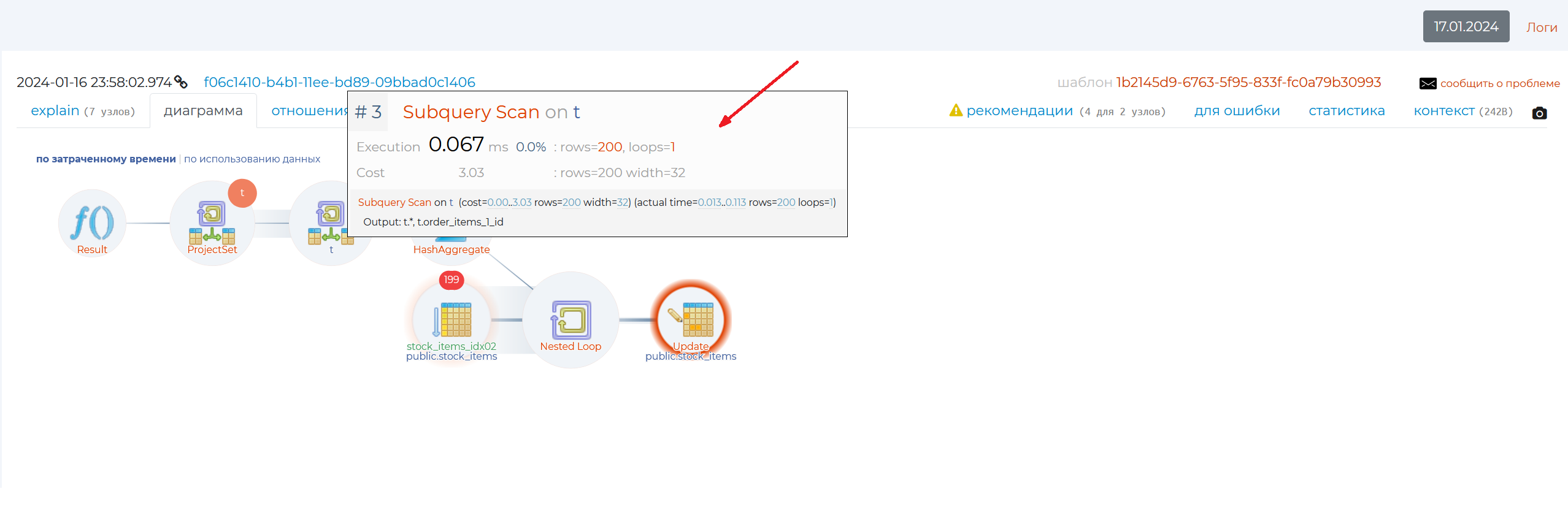
Clicking on each circle will take you to the Explain tab.
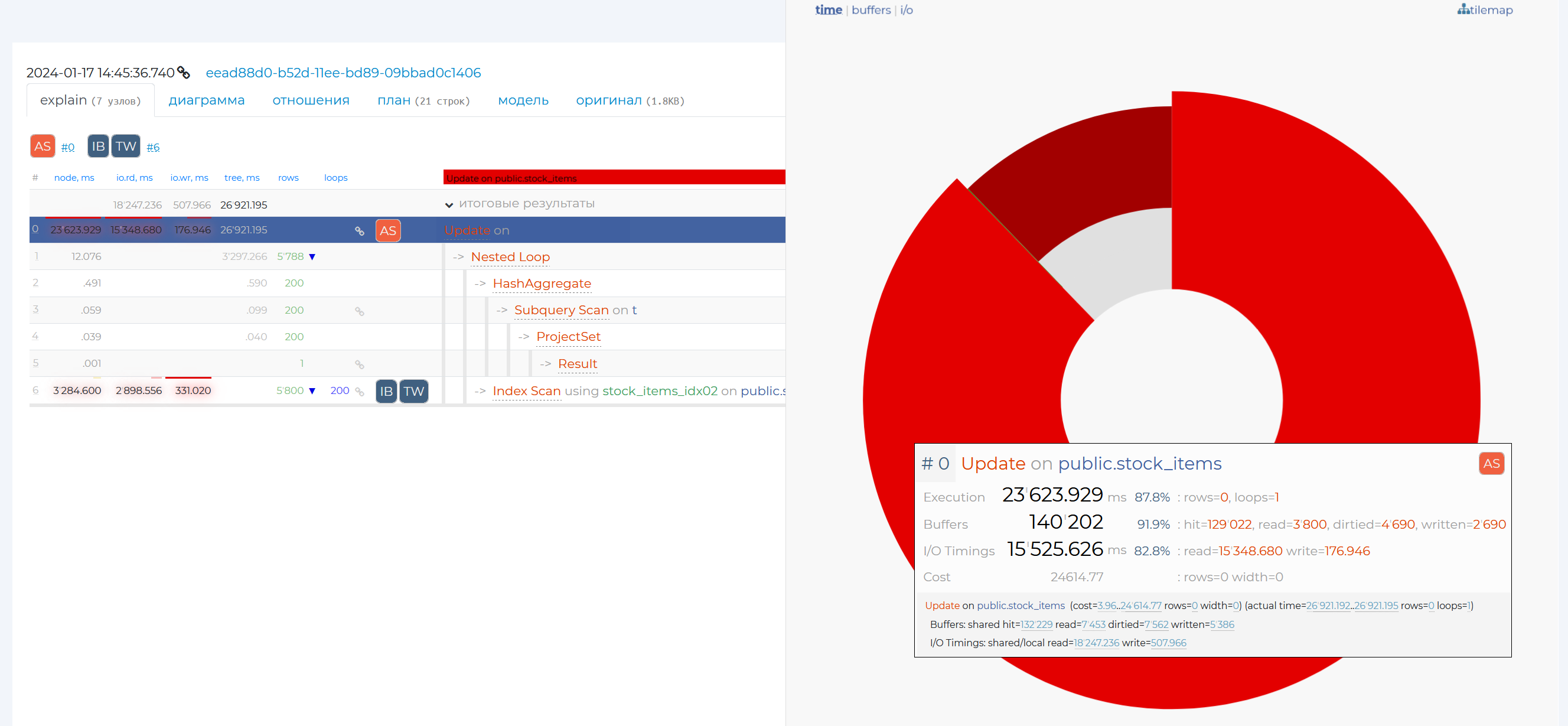
“Explain” tab
The information is presented in a table containing the following columns:
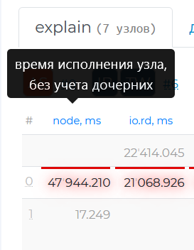
node, ms — own execution time of the node without taking into account children (the same as execution on the diagram).
io.rd, ms — result of the explain attribute “track_io_timing”, the time in milliseconds that was spent to read data from the disc. If you move the mouse cursor over the value of this column, a tooltip with the speed of this operation will be displayed.
io.wr, ms — result of the explain attribute “track_io_timing”, the time in milliseconds that was spent to write data to the disc. As for the previous column, hovering the mouse cursor over the value of this column will display a tooltip with the speed of this operation.
tree, ms — execution time of the whole node including the whole subtree (the same as actual time on the diagram).
rows — the actual number of rows returned by the node (the same as rows in the diagram). If there is a blue triangle next to this value, hovering the mouse cursor over it will show you how much the actual value of the number of returned rows differs from the planned one. If there is no triangle, then the two values are congruent.
wraparounds — number of repetitions of the given node (the same as wraparounds in the diagram).
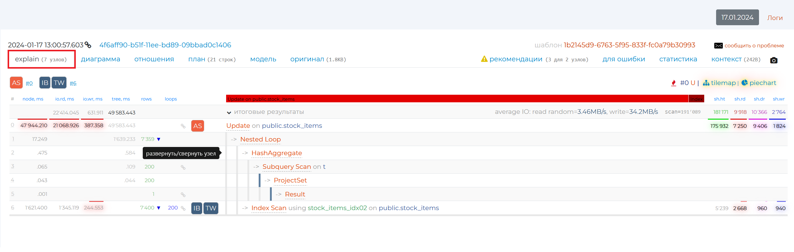
You can also see information on the contents of the columns in the tooltip that appears if you hover your mouse over the column names.
The node names are listed to the right. When you put the mouse cursor over a row with a particular node, rows with its child nodes are highlighted in grey. If you click on the corner next to “totals”, you will expand the detail for each node in the plan. You can also hide and reveal information on each node individually by clicking on the arrow to the left of their names or just in the empty box around the nodes.
In the first node detail brackets after the word rows is the number of rows that were expected to be obtained as a result of executing this node, in the second brackets is the number of rows that were actually obtained.
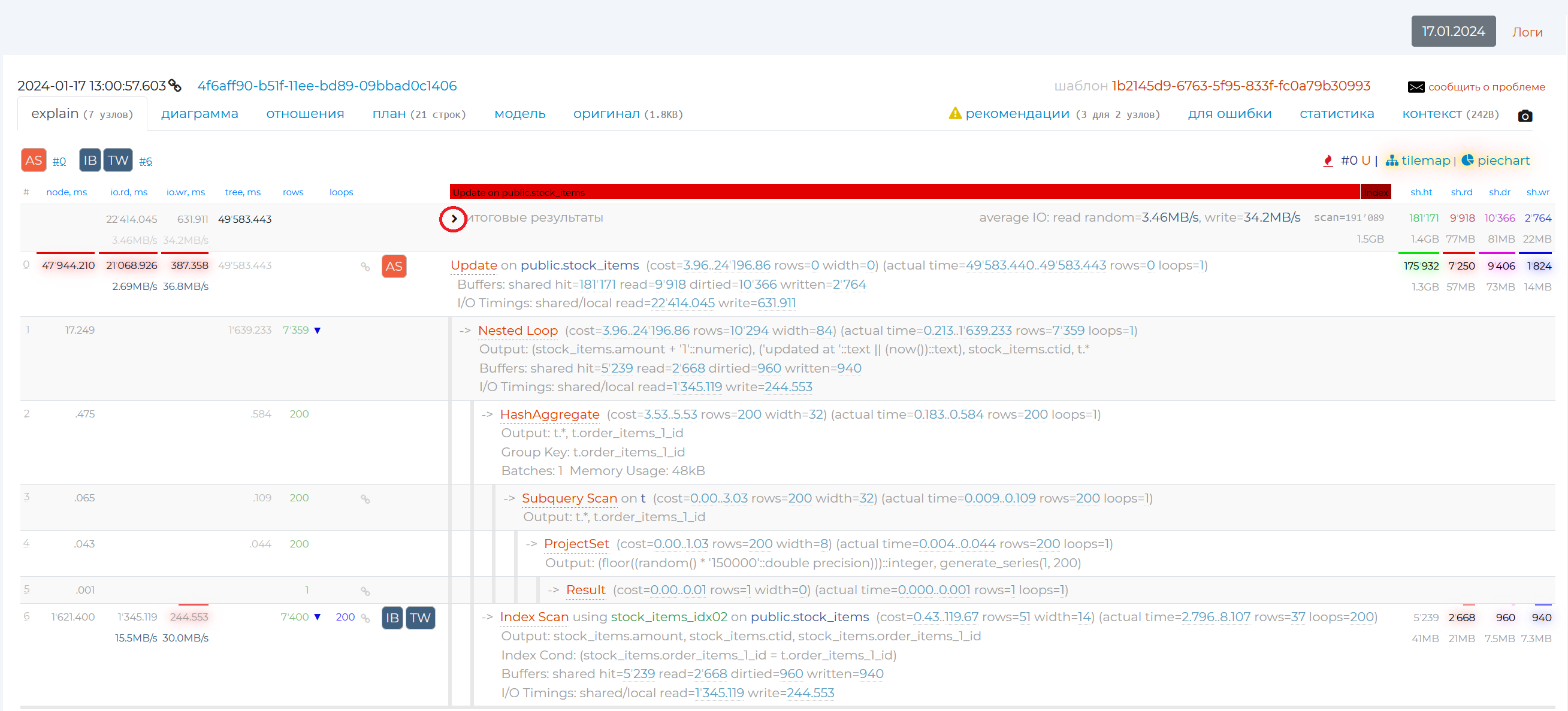
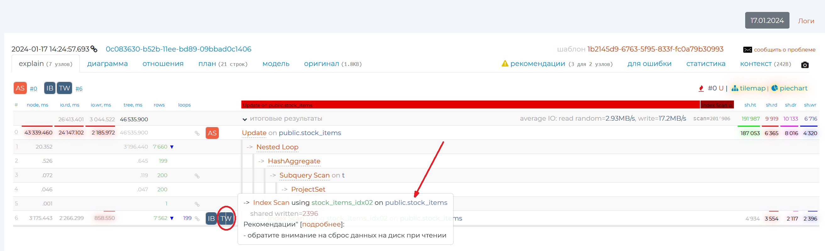
Let’s review the 4 columns that are on the right. They show the result of one of the explain command options, “buffers”. By writing “explain buffers <query_text>” in SQL, you can see the result of this command manually. It shows the type of memory from which the information was read or written, as well as the amount of that information in pages. Normally, each page has 8192 bytes of data if you haven’t changed anything in the configuration. You can check this by writing the query “show block_size”. Thus, these 4 columns carry information on how optimised a given query from the resource usage archive is:
sh.ht — shared hit, read from cache, one of the fastest ways of reading, it should be mostly used in queries.
sh.rd — shared read, read from disc when not in cache. This method of reading is best avoided, it is one of the slowest.
sh.dr — reading from the server’s shared memory, when, while we were trying to get the data, someone had already changed it, and we had to look for this data elsewhere. A quick way to read.
sh.wr — writing to disc from shared server memory, this is slow.
The upper and lower numbers from these columns, highlighted in different colours, show the values of data hits to these types of memory from disk and from cache memory.
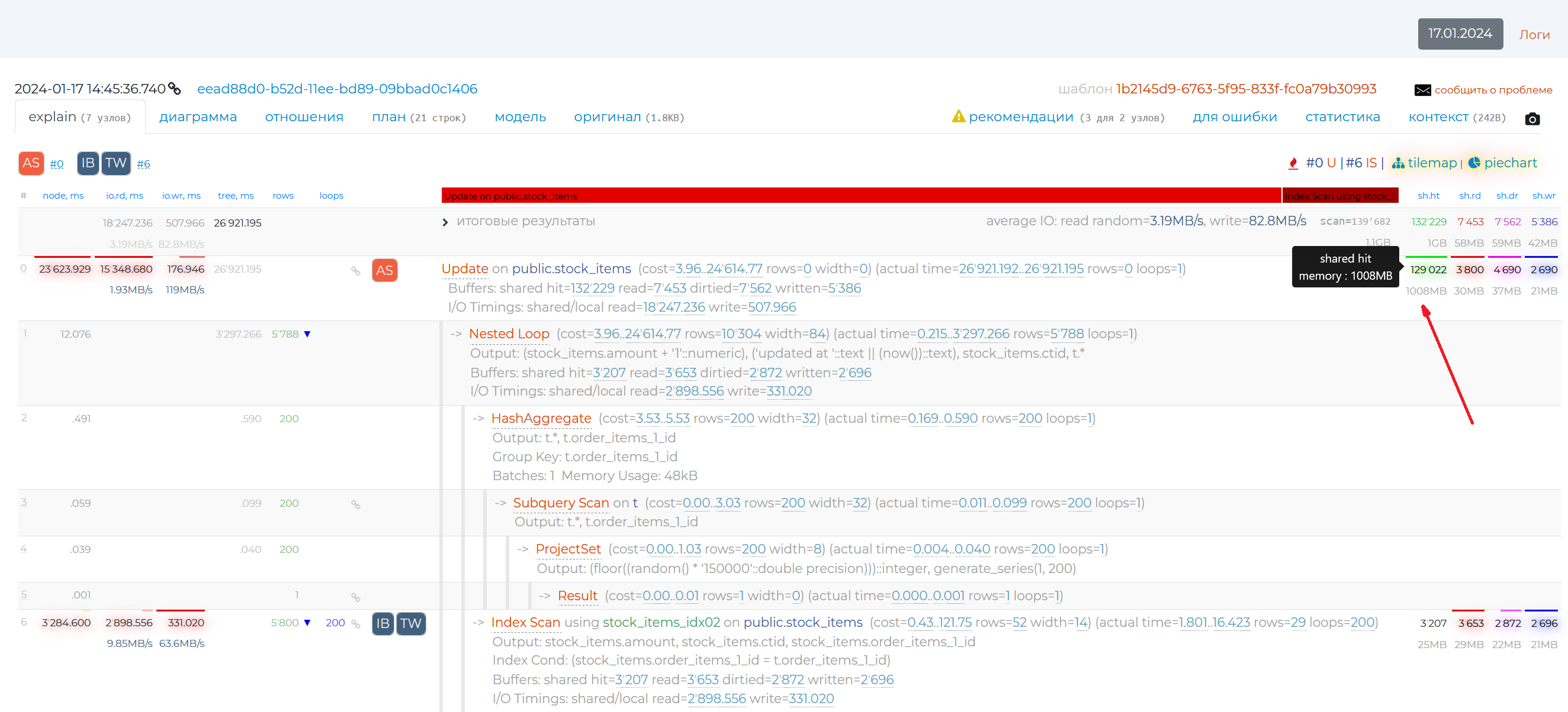
The rows of some nodes have square icons in them. The numbers with a “#” to the right of the icons indicate the number of the plan node to which the recommendation applies. Recommendations appear if the part of the SQL query associated with that node is written in a suboptimal way. If you hover over such an icon, you will see a recommendation for that node. If you need more information on this problem, you can click ‘more info’ link and read an article on the subject.
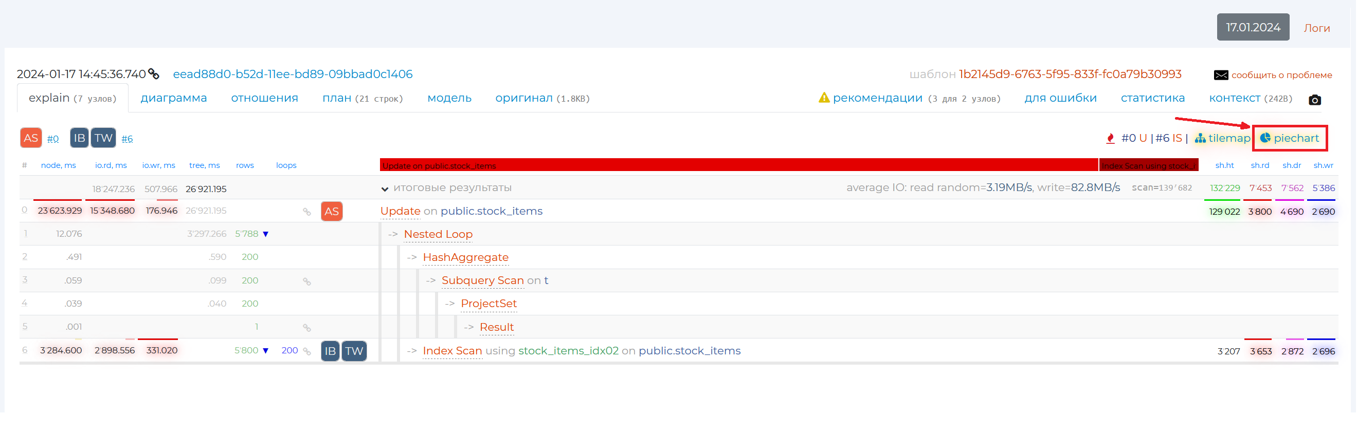
To the right there is the “piegraph” button.
It opens a pie graph that visually represents the proportion of time taken by a given query node in the overall query execution. The diagram shows only two nodes out of six (in this example) because the time taken by all other nodes is negligible.
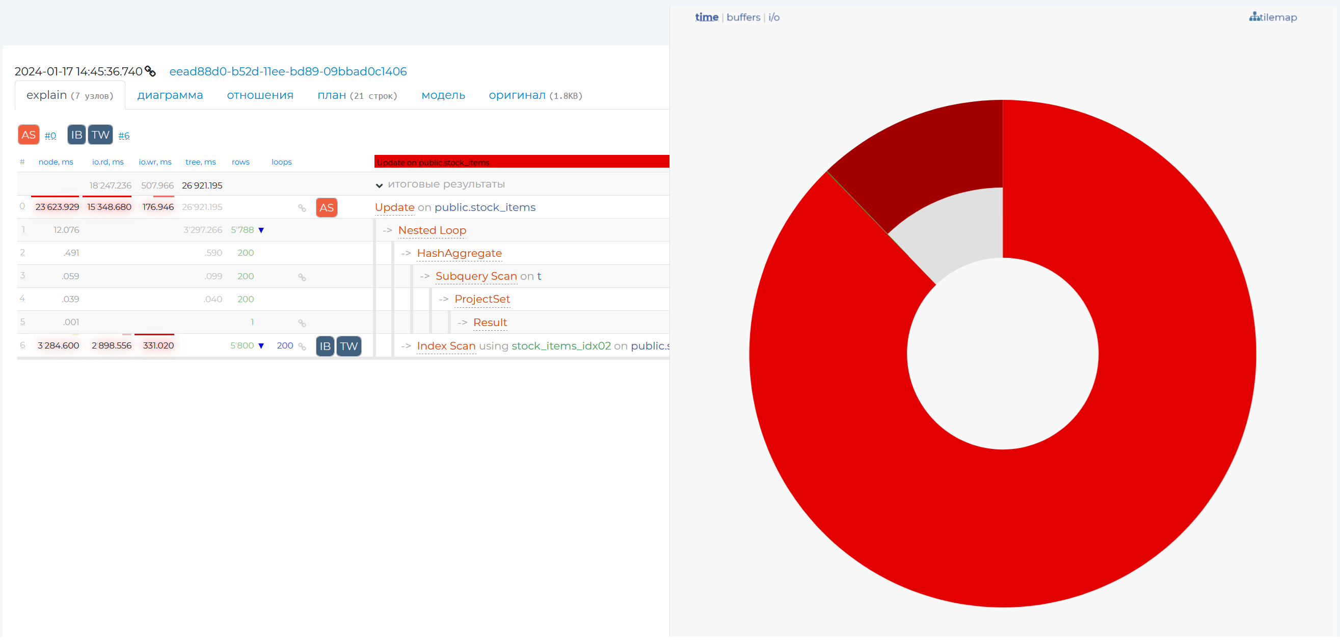
By hovering over a particular share, you will see more detailed information on that node, and if you click on that share, the row with that node will be highlighted in blue in the table on that page.
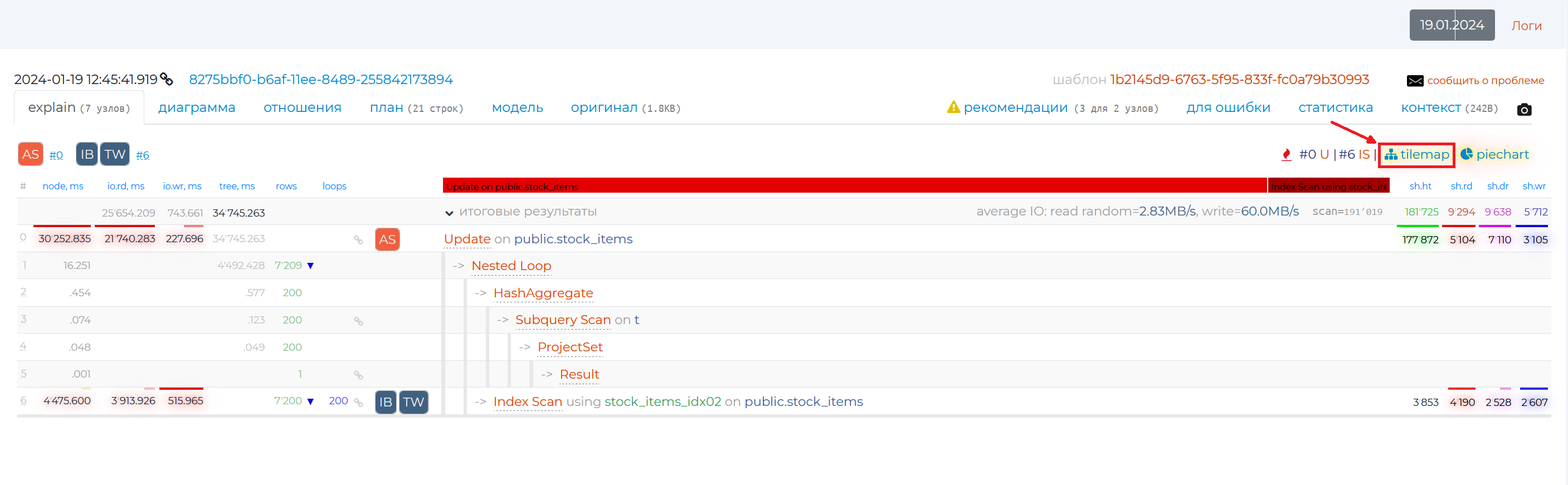
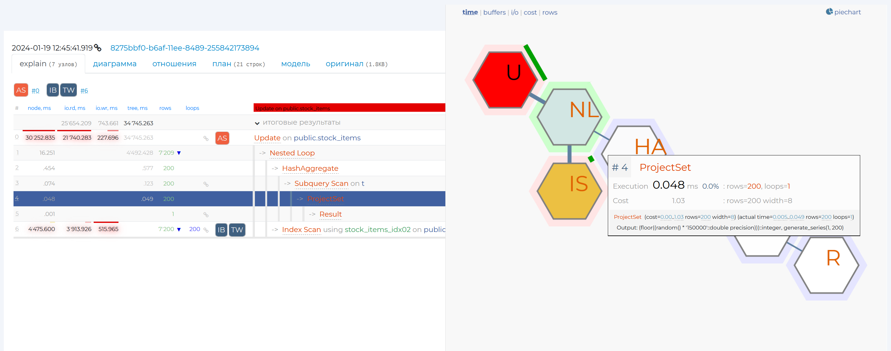
Just to the left there is the “tilemap” tab.
This graph too shows different information on the plan nodes of this query. For example, the communication between these nodes. The thicker the stem between nodes, the more resources they transfer. The colours of the nodes show the costliness of each node. The node that spends the most resources is highlighted in red, and the one that spends the least resources is highlighted in green.
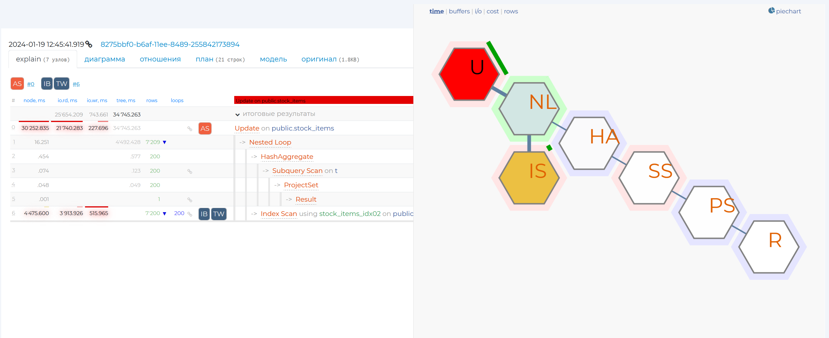
When clicking on the node, you will see more detailed information on that node, and if you click on that share, the row with that node will be highlighted in blue in the table on that page.
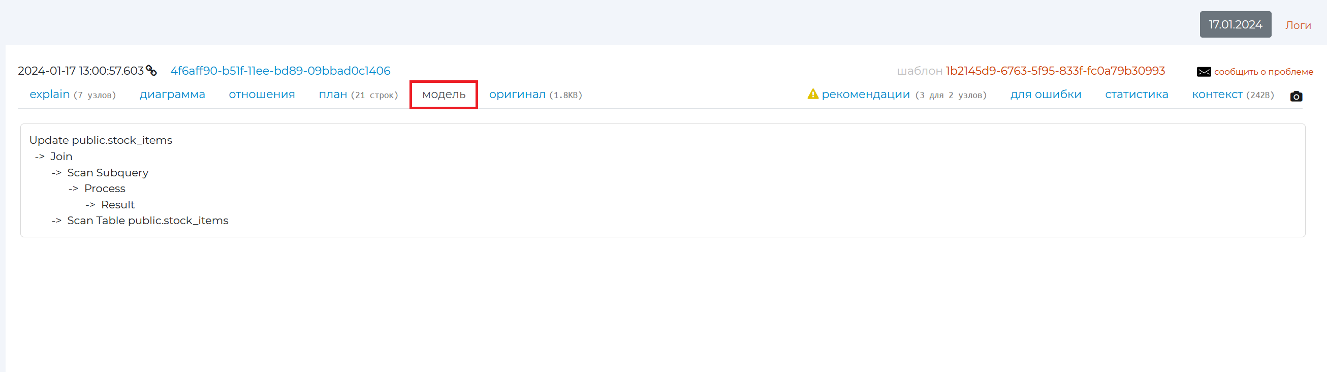
“Model” tab
This tab presents a simplified model of the query plan from the archive, showing only the names of executed nodes and their order. The details for each node are hidden.
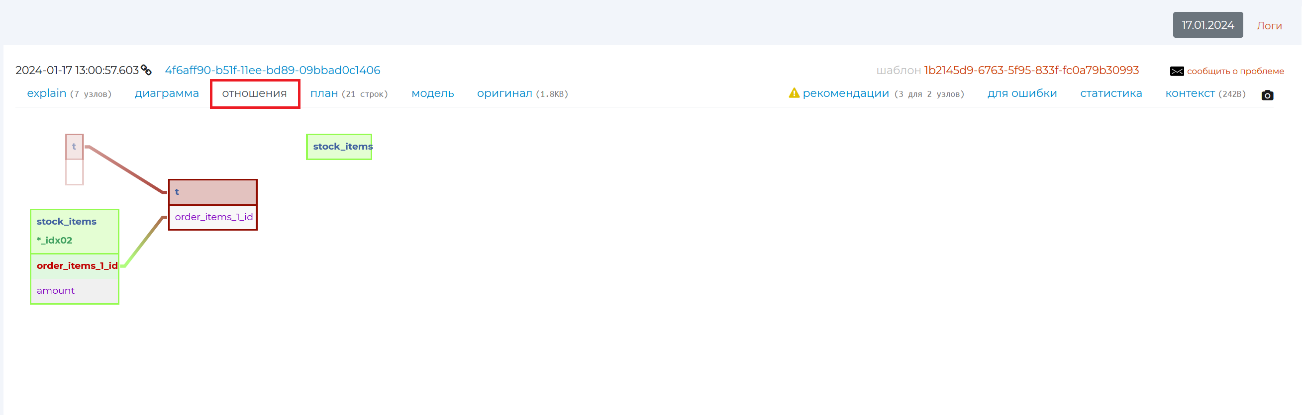
“Relations” tab
This tab shows the relationship diagram of the tables involved in this query.
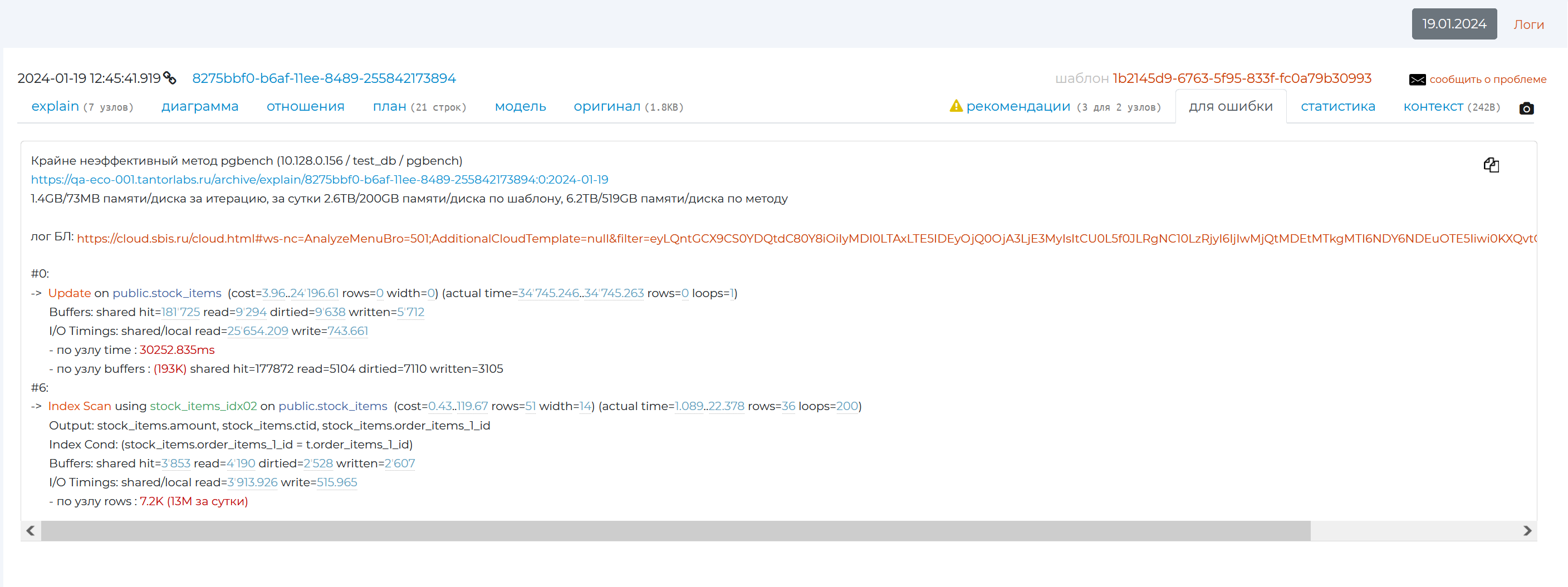
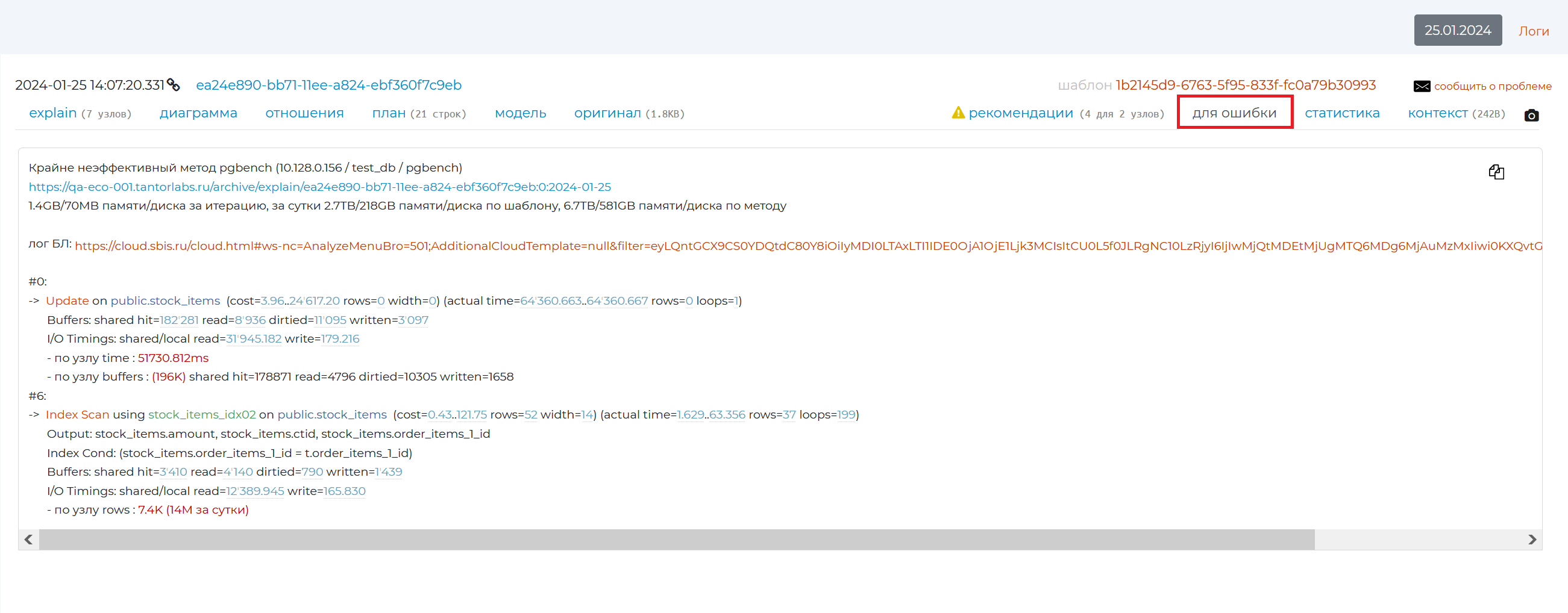
“Error pattern” tab
This tab contains a pattern, using which, if you find an error in the query or that it is not optimised, you can create an error and send it to the creator of the query.
The first line of the error pattern contains the method that used this query. It is followed by a link to the specific plan. Statistics are then written about how much information was read by the query and used on the disc per iteration, per day, per pattern and per method. And at the very bottom, the first 10% of the nodes that created the load are listed. Using the copy icon in the top right corner, you can copy the pattern text for the bug and send it to the developer.
Button for creating a link to a task
Clicking |task_link_button| brings up a window for creating a link to a task:
This option is needed in order to fix an error on a particular pattern and not to create it again after a while, but to see that it already exists. It allows you to link this pattern to an accounting and bug tracking system (e.g. in jira). Pg_monitor will allow you to navigate to the task specified for this pattern in a system that you are comfortable with, using the link you insert into the text box (labelled in the image below).
After creating a task on the “Problematic queries” page in the “By pattern” tab, an icon with the task will be fixed in the line of the given pattern, clicking on which you can also go to the system with this task. It will also clip next to the pattern ID number on the detail page for that pattern and on the query page from the archive.
When you click on this icon, you will see a modal window with the specific date of the task, the due date and a link to it. The window has a text box to insert a link to a new task on this pattern if needed. To create more tasks related to this template, click on the “+” sign. To delete a task, click on the basket.
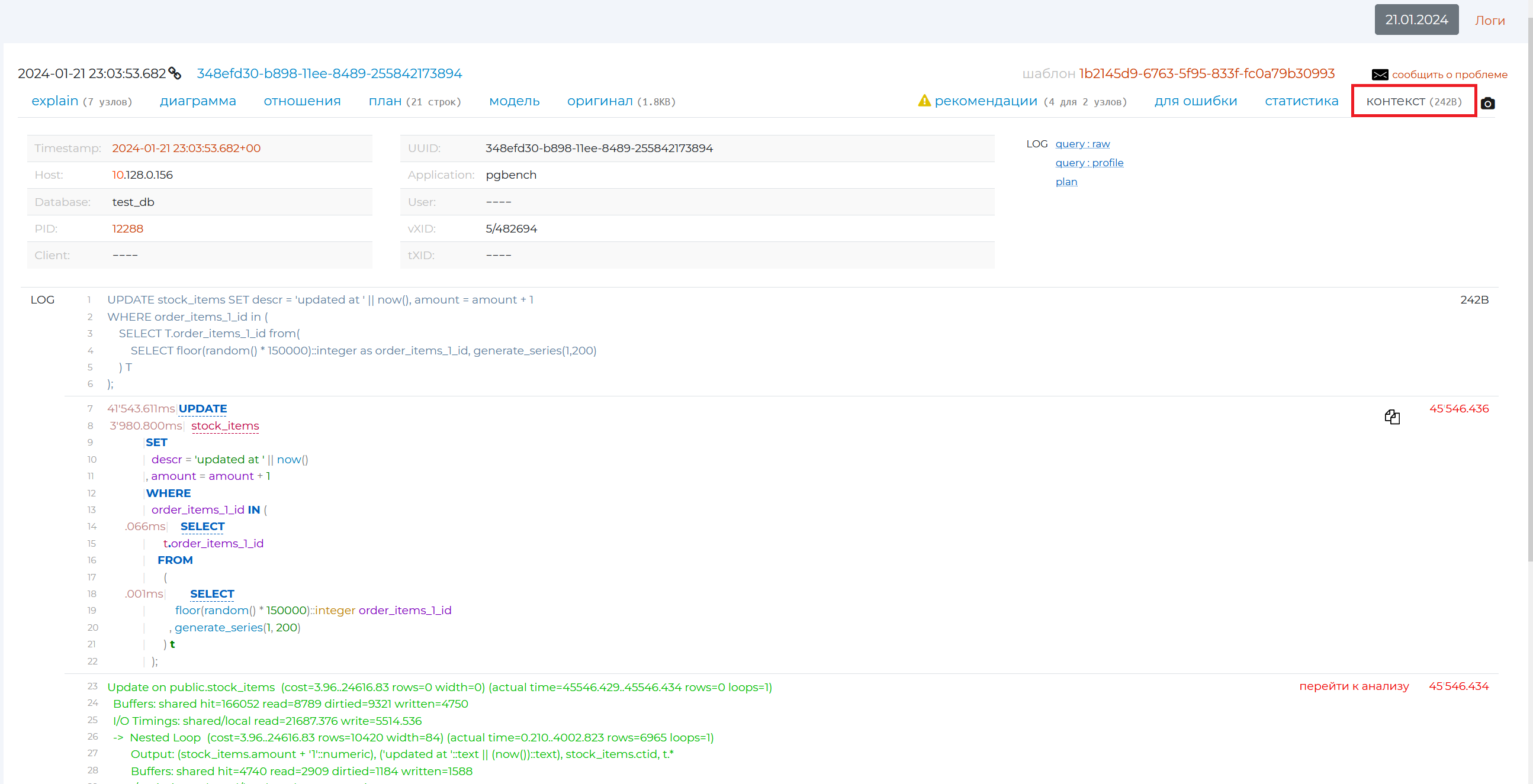
“Context” tab
The top of the tab contains all the detailed information on the query from the database log.
Further down below is the original query form (written in grey font) and a more visual form (highlighted in different colours). This query can be copied with all its parameters using the copy icon on the right.